Where should I go next? Perceptual salience in level design
23 July 2022
The primary objective of level design is to clearly communicate to players where they have to go or what they can or cannot do within a level. Color coding and lighting are just two of some level design techniques relying on visual perception to convey design intent or highlight important parts of a level. Recently released Stray, where you play as a cat finding its way back home, gives a lot of good examples of such techniques. In this post I’m adding some science behind it to help explain why navigation with color and light works the way it does.
Stray is out of the bag
One thing that immediately struck me about Stray is how effectively their designers used light and color coding to navigate player throughout the complex, highly vertical and dense cyberpunk city. True, oftentimes it’s a bit too much on the nose but it also makes the game less demanding or taxing on player’s cognitive capacity (apart from the puzzles, which I’m not gonna cover).

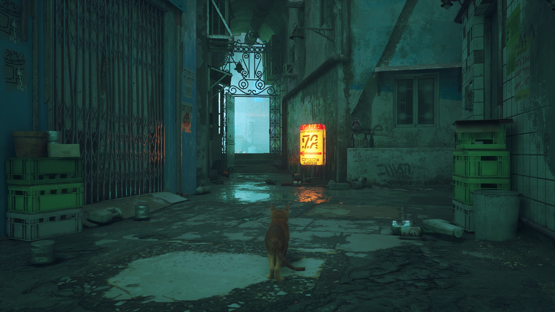
Right at the beginning, when you land on all four from an unexpected fall, you find yourself in a dark, dimly lit gutter. The only thing you see is both real and proverbial light in the distance, signaling where you need to be headed next. As you ponder about your next steps, a cutscene interrupts your contemplation and a blinking orange light appears over the door, which abruptly opens and shows you the way out.
But that’s just one of the cases where level design of Stray uses color coding and light to navigate its players on an intended path. Below is a couple of examples of what I mean – notice neon signs, lit spaces, and other ways that aid the player in navigation and rely on a cognitive bias called perceptual salience.

The theory behind it all
As I mentioned in my previous post, game and level design specifically are backed by findings from cognitive psychology and related phenomena. A lot of techniques that level designers employ intuitively, stem from research on human perception and cognition. The ones I’ll talk about that explain how visual perception and thus player navigation in video games work are: perceptual salience, attentional set, invisible gorilla effect, Von Restorff effect aka Isolation paradigm, and some basics of color theory.
Perceptual salience
In neuroscience and adjacent fields, salience is a property or quality of something standing out from the rest. Saliency usually arises from the difference between an item an its neighbors, caused by a different color coding, light value, etc. In general, salience is used in the studies of human cognition and perception to refer to any aspect of a stimulus that stands out from the rest.
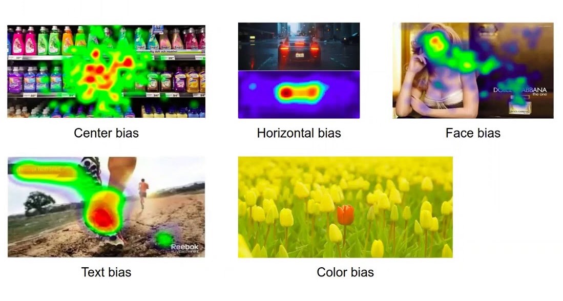
A couple of well-known biases are featured in the picture below, taken from a study by Levia et al. [2020]. You might have not heard about them specifically but let’s be honest, you did notice that your eyes track the same pattern as the heatmaps show on each of the pictures, right?
Why is this happening?
Despite people realizing, human brain lacks one important quality – it doesn’t possess the horsepower to process everything at once. Human brain is highly selective so it can avoid overloading itself. Take your field of vision. In order to conserve energy your brain automatically filters out things that don’t match what you’re searching for.
This phenomena is called attentional set, and is formed when a subject learns that a set of rules can be applied to complex stimuli to differentiate relevant from irrelevant cues [Heisler et al., 2015]. This is the very reason why really good horror movies or video games know how to set up expectations and when to break them to surprise and scare their audience to the maximum.
Invisible gorillas
This focus on something that we expect also allows for exploiting this bias for the opposite results. Unexpected or odd objects that are out of context or are not within the attentional set, will fall through and might go unseen even if you’re looking right at them. Truthfully, until searching for examples for this article, I didn’t have a clue about and never noticed all the twins in the Woman in Red scene in The Matrix. Did you?

Wachowskis purposefully casted this sequence with identical twins. Have you ever noticed them?
This phenomena is called “inattentional blindness”. You might have encountered it in popular science as an experiment called the invisible gorilla effect. Without spoiling too much, watch this video to see what it’s about. The experiment was created and described in a book by psychologists Daniel Simons and Christopher Chabris.
Isolation can be good
Additionally, how human perception notices objects that are in its purview also depends on how the object’s meaningfulness or physical nature is changed in size, shape, color or spacing. According to Von Restorff effect or isolation paradigm, the stimuli that stands out from the homogenous rest in a distinctive way are easily learned and remembered. For all the nerds out there, Hedwig Von Restorff was a German physician, who coined this term in 1933 based on her own observations and principles stemming from gestalt psychology.
Application in video games
I already mentioned some examples from Stray, let’s look at some more now with knowing the science behind it.
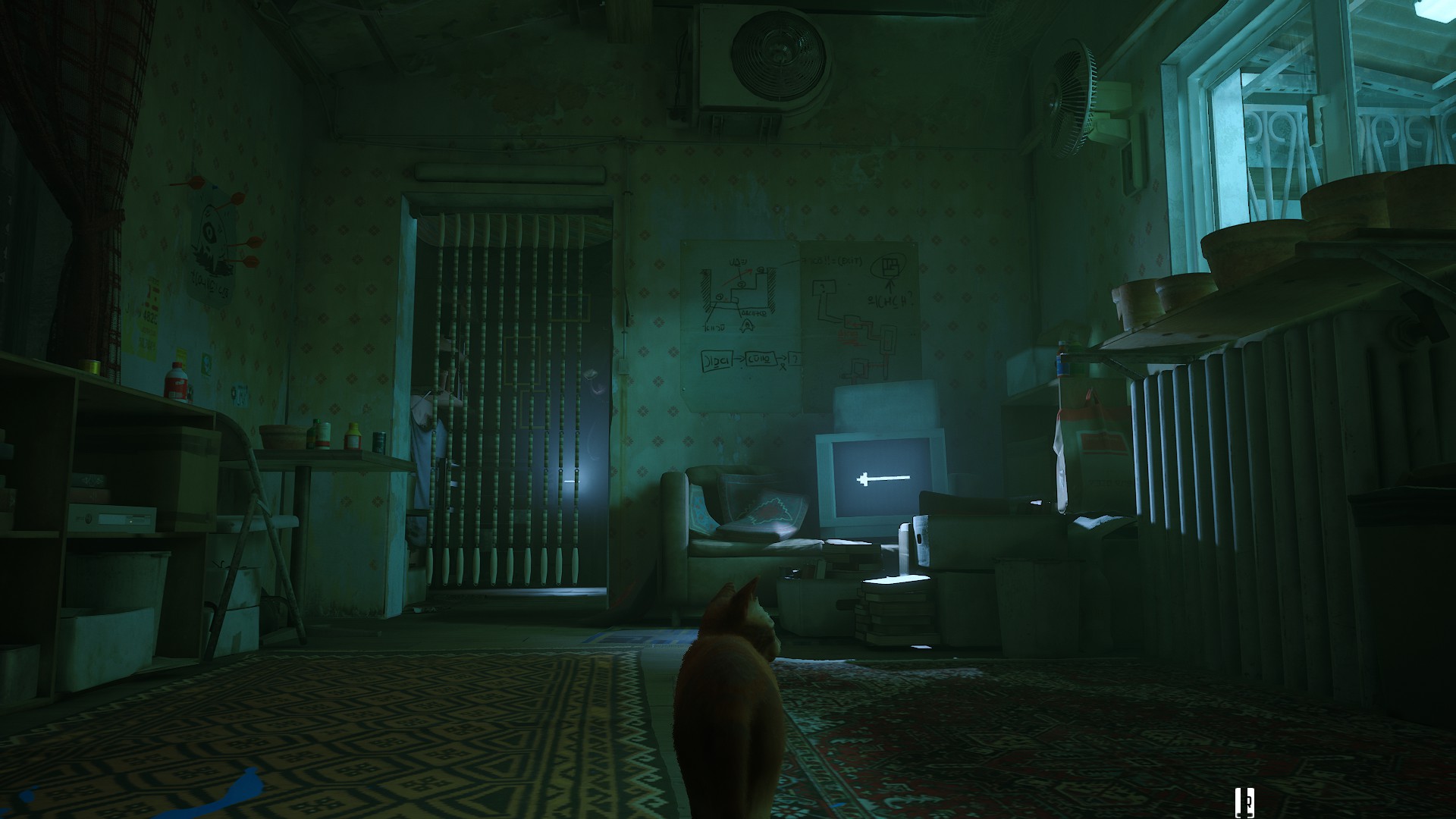
I don’t think this one needs too much explanation. Though, if the white arrow wasn’t enough or you were not looking at the TV from this specific angle, there’s a light behind the door luring you in.
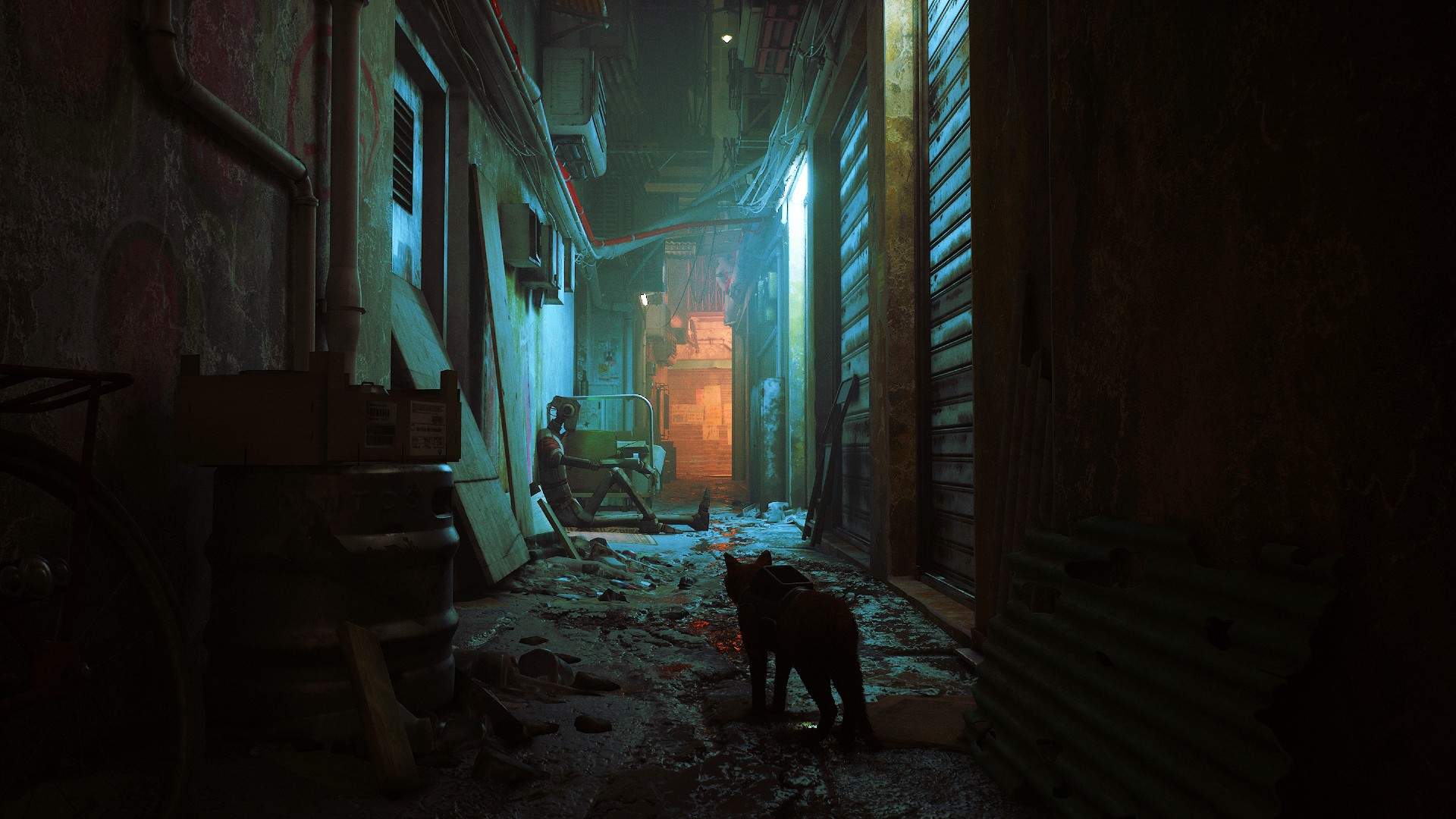
At first look, this might be a little bit cluttered scene, some players might want to figure out their way up but both light on the right illuminating the robot and the orange color attract and show the player where to go.

This one confused me a bit at first. My eyes were naturally drawn to the blue intercoms on the right. Only after examining them it struck me that the godrays were signaling where to go.
Yellow signifiers
There’s a running joke among level designers about anything colored yellow in real life being a sign of a good level design. Ok, maybe it’s not a joke that every single level designer tells but I know a couple who do, so… ¯_(ツ)_/¯
Yellow (or white) is used in modern games as a color code for conveying the functionality of an element. Oftentimes, based on the example from games such as Uncharted, Tomb Raider, The Last of Us, or Horizon Zero Dawn, yellow signifiers are elements that are climbable or help a player with traversing a level. If you’re familiar with affordances this one is a cognitive signifier.
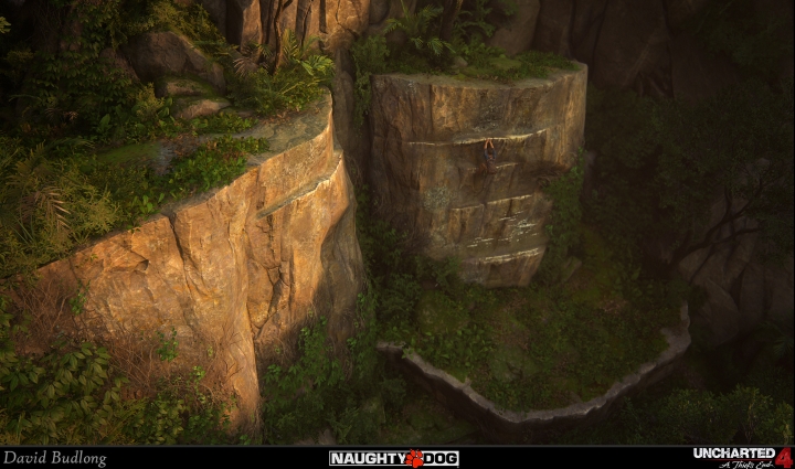
Once you’ve been trained to be on the lookout for yellow signifiers you’ll start to notice anything that’s yellow. Your mind is looking for it because it’s been placed in your attentional set. In the case of Horizon Zero Dawn, designers also used yellow for their game UI, further supporting the player’s sensitivity towards yellow.

We see this type of color coding all the time in video games, though there are no officially established rules about yellow or white being the best color for signifiers. However, yellow and white have some benefits – both are usually not present in the color palette of video games, and therefore it’s easier to look for them. Yellow is also naturally attention-grabbing color and is the most visible. In small amount yellow draws notice to itself, also because it models the real world scenarios where yellow is used for example on warning signs.
God Rays
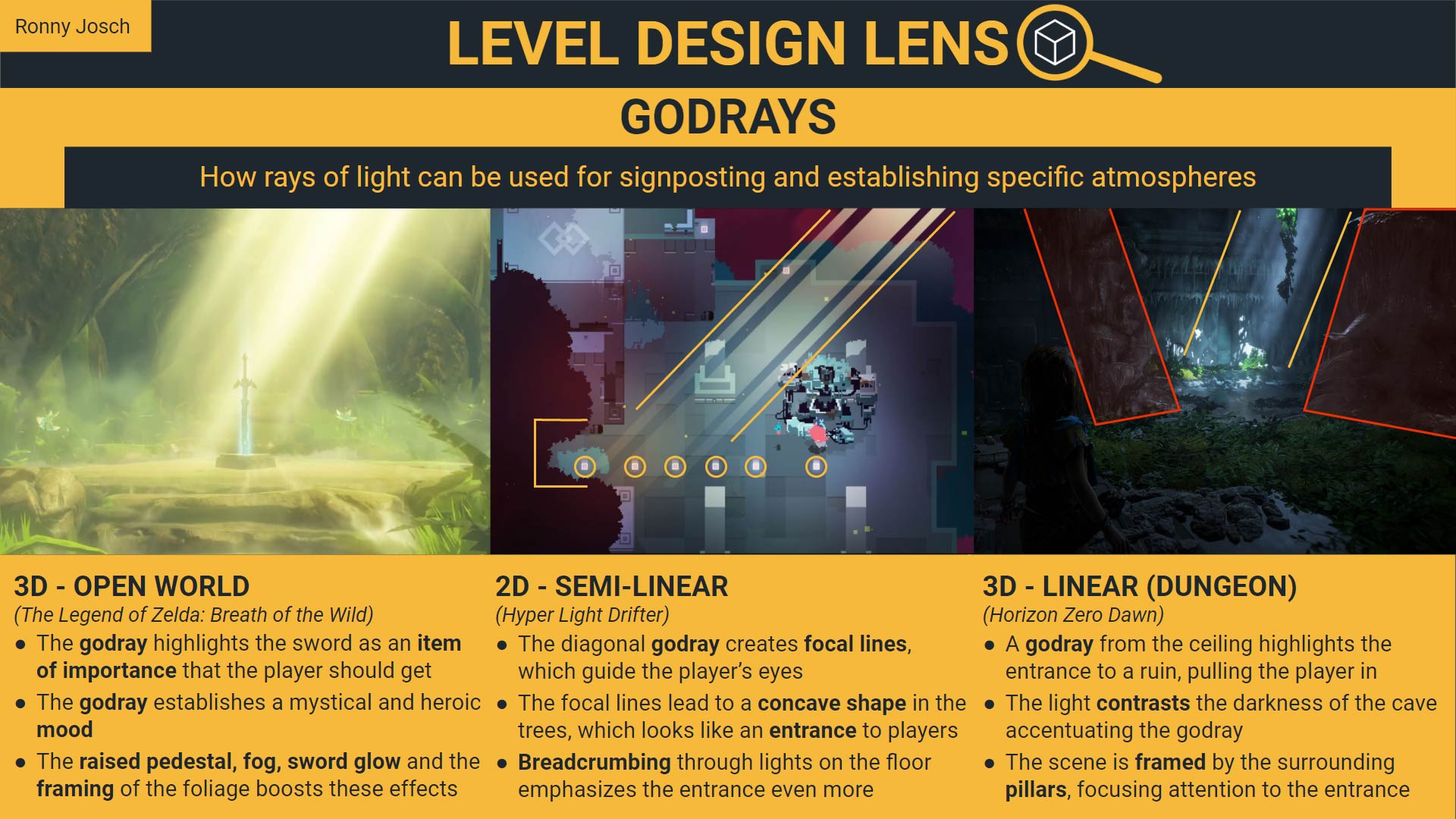
A very special (and my favorite) type of, in this case, using light to navigate player are so called god rays. In nature, god rays are sunbeams that appear when sun is just below the horizon, and the contrast between light and dark is very distinctive. In video games, god rays appear often in caves or darker forests when light peaks through crevaces and branches to lit something of importance. Ronny Josch explains them and their usage in level design way better than I do in the infographic below:
Summary & takeouts
The above mentioned were just a couple of examples of perceptual salience biases in video games. Would you come up with your own examples? I bet you would. So, let’s wrap it all together into a couple of important takes helpful for building levels.
- Human brains are selective in what they look for
- If something stands out due to its size, color or shape human perception will focus on it voluntarily
- Once a thing enters attentional set, human brain will expect and subconciously search for it
- At the same time, odd objects or those you don’t look for might stay unseen
- Color coding works as long as it’s consistent
- If you’re cognizant of the aforementioned biases, you can both show and hide things from players at the same time
By the way, now that you are aware of these rules your mind will subconciously latch onto them and you will notice all these things way more. You’re welcome! L.
Sources
- https://www.psychologyofgames.com/2013/09/why-do-color-coded-clues-in-level-design-work/
- https://ronnyjosch.com/level-design-analysis/
- http://ixd.prattsi.org/2019/02/design-critique-uncharted-4-traversal/